This post first ran on my client Think Creative Collective’s website. Click here to listen to my podcast episode with them on the Strategy Hour Podcast!
When it comes to drafting up your copy for a Facebook ad, you can’t just one-and-done apply the copywriting techniques you’d use for Google ads, or the copywriting techniques you’d use for a sales page.
Facebook ad copy is a different kind of bear, and here’s why you need to tackle them a little bit differently.
Your images actually count for more here: upwards of 75% of your ad’s conversion rate is all thanks to your image, show studies from Consumer Acquisition.
BUT, I would follow that up with two things:
- 100% of your ad’s conversion is due to the offer itself, so nailing messaging for that is paramount.
- AND … if only a tiny piece of the pie is due to that copy, then buddy, it’d better be good.
Read on for 3 Facebook ad copy tips to get you started with your words, and keep in mind for your next launch!
Plus, as you get those ads ready, be sure to get your hands on my Sales Page Anatomy FREEBIE right here! ????????????
Tip 1: Play to the 20%-of-your-image-can’t-be-text rule.
If you’ve ever run a Facebook ad with text over the image, you know that Facebook wags their finger at an image loaded up with text.
I’m all for you testing some options, but I do think that one of your ad sets should include an ad with copy over the image!
Here’s my trick. Want the copy to pop a little more? Blur the image a bit, up the exposure, or feature a flat-lay shot that’s heavy on one product. These are little tweaks you can implement to accurately adhere to FB’s guidelines, but still get your wily words in front of your tribe instead of posting super busy imagery.
Oh, and don’t forget about Facebook’s free text overlay tool, so you can test your copy-to-image ratio first (just make sure your copy isn’t bleeding over one of the gridlines — keep it right, keep it tight!).
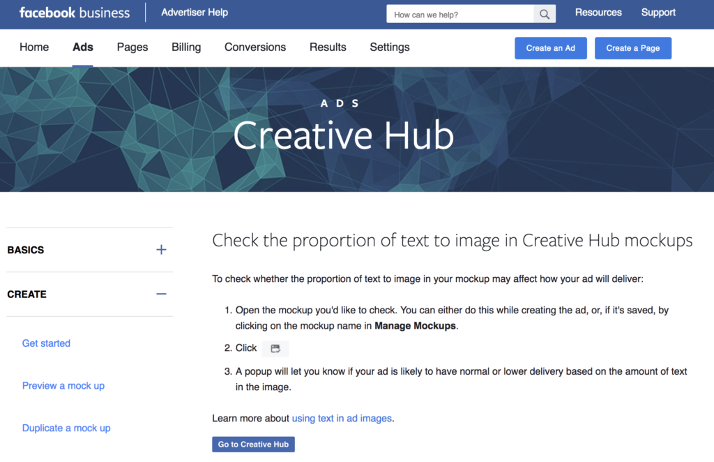
OH, and yes, the 20% rule is starting to disparate Harry Potter-style in a few countries, but most Facebook ad experts recommend stickin’ with it for a while.
Tip 2: Write both TOFU & BOFU ad copy.
As a launch copywriter, I write a bunch of ads, and clients and I daydream a bit at the beginning when we’re funnel-mapping their launch: “they go here and here, then they get this and go here, but if they click this they get this and go here, but if not they go here.”
It’s never confusing at all. 😉
Anyway, it’s super helpful if you think of your copy in two formats: TOFU—top of funnel—and BOFU—bottom of funnel (and I learned those adorable acronyms from my favorite copywriter ever, so take credit I cannot).
First, write a set of ads (or a few sets) pre-launch speaking to those you want to turn into leads or subscribers.
If you’re familiar with Eugene Schwartz at all, you may have seen this guy:
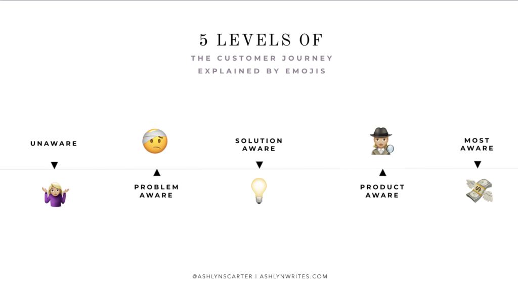
So, without getting TOO nerdy on you, the messaging on these tends to fall in that first little group: pain-aware. They’re unaware of your specific solution, so don’t even mention it. Talk to their pain.
Later on, in BOFU, you’ll be redirecting ads to those who landed their pretty selves on your sales page, webinar, etc. — and for those, your goal is a sale. This is where you add in copy faves like urgency, scarcity, and bonuses.
Tip 3: Nail your message matching.
Message matching is when you write copy … and then when your reader takes the action you want them to, the next thing they see is that last message.
I talk a little bit about that in this video about how to write your headlines.
Like, when I click on “Get 30% off this weekend only” on a Pottery Barn ad, I need to be landing on a page that says “30% off Memorial Day sale this weekend only!”
Does that make sense? It’s not super-duper creative-feeling, but it’s best practice to lean on in your copywriting, especially for Facebook ads.
You can practice message matching by:
- Having your over-the-image copy match the Facebook ad’s body copy
- Having your Leadpage copy reflect the Facebook ad copy
- Having your sales page copy reflect your Facebook ad copy.
Take it from this pro copywriter: “If Facebook users are going to stop and look at the image first, the copy will get them to click.”
And that’s it!
Want 3 extra lightning round tips? Ok, I’m glad you asked!
First, keep it short and snappy — again, they always win on rankings. Second, putting a background color behind copy tended to convert well in some Consumer Acquisition studies, so try color blocking. Finally, treat your headline like a call-to-action all of it’s own … write for the click.
As you prep for a launch, you may find these blogs helpful to read next:
Related: How to Create a Sales Page your audience actually wants
Related: 3 Ways to Write Better Facebook Posts
????Don’t leave without grabbing your sales page anatomy! ????
Reading Time: 4 MinutesReading time: 4 min. This post first ran on my client Think Creative Collective’s website. Click here to listen to my podcast episode with them on the Strategy Hour Podcast! When it comes to drafting up your copy for a Facebook ad, you can’t just one-and-done apply the copywriting techniques you’d use for Google ads, or […]


comments +