I’m getting a *custom* grown up website for the first time since being in business nearly 5 years (and I’m SO excited). BUT I’m pretty proud that I built an over half-million dollar a year business off a $997 Showit website template from Tonic Site Shop.
I know I’ve said it recently, but I’m gonna say it again: copy dictates the design … not the other way around.
The design of the website doesn’t come first. It’s the reverse that needs to ~actually~ happen.
I love custom work. Those of you who do it, I do it myself.
But even with copywriting, I always tell people, I don’t particularly want you to spend a whole chunk of change on custom copywriting, if you haven’t been in business for about three years.
There’s something to being able to test and validate your ideas and get your lay of the land before you turn around and put a chunk of change into a one-on-one service. I say it all the time about copywriting, now I’m saying it about design.

For me, I have an eye but I have a really, really difficult time actually making that translate. I was the kid in college who loved art history class, but not necessarily an art studio class.
Here’s why I am so pro website design templates:
There are so many gorgeous design templates out there where you can get that look and feel that you’re going for without a custom design at a fraction of the price. You’re also able to put your money towards product development and figuring out some other things before going all in on a custom website and design.
All right, that said, here are my five secrets to choosing the best website design template for you in your creative small business.
No. 1| Choose a platform
Before you choose a website template, take a step back and think about the platform.
Choose a platform that you can either learn enough to be dangerous in, or be able to move sections around in.
Naturally, at some point after the copy is written and the message is organized, it is going to back up against the design that’s already laid out there in the template. And for good reason, the professional designer made this as a template, right?
It’s for multiple different types of businesses to use. So make sure that you can learn the language. Here’s the beauty about templates these days—you don’t have to know code.
This is why my two favorites over the years, again, from both building my business and helping clients install their copy, are Showit and Squarespace.

BEFORE you look for a website template, go try out trials on the platforms you’re interested in and see if you can learn the interface of it.
Maybe you need to duplicate them or stack them differently or you’re gonna want to organize it differently. Remember, you’ve got the message now and you’re just trying to plug this in to the template. It’s going to look a little bit differently than maybe that template coming right out of the box.
So you need to be able to arrange those and not feel like a fish out of water.
Takeaway here: learn the language in the platform that you’re using.
Related: 3 Tips to Launch a Website, Product, or Service
No. 2| Look past imagery
This is kind of a hard one … but look past the brand photos and imagery that is used within the website templates as you’re shopping around.
It is SO easy to get distracted with this.
Don’t let the photos that are not a view sell you on the template– you need to be looking at how that designer has orchestrated and laid out different elements.
(I walk you through a few templates in this weeks YouTube video, you can watch that here.)
This brings me to part two… I believe in investing in brand photography before investing in custom website design.
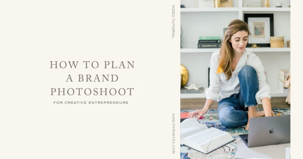
The brand photography will get you farther. I did a video where I bring you behind the scenes of how I did a brand photo shoot with my photographer, Abby. This is something I did early on for trade in my business…I would trade a couple of pages of website copy with a photographer who came into my office and shoot.
On your shot list make sure not only to have those head shots of you, but you want people to know what it’s like to kind of step into your office… so to speak. Even if you don’t have an all put together office, they need to understand the concept of what it is like to work with you.
You cannot illustrate that any more clearly or quickly, honestly, than with a photo.
+Copy is not gonna win on that game.+
The photo will get the information across so much quicker.
There are great stock imagery assets out there. Shay, one of my friends, is behind Social Squares, this is a great resource. That first website I had before I bought my template, when I built it all myself on Squarespace, I paid $70 for a photo that I used as the hero image — I used that image sooo long.
No. 3| Choose a website template in the realm of your industry
Google did a study involving 119 screenshots and found that low visual complexity (aka clear and simple, not cluttered) and high familiarity (aka it seemed similar to what they’d seen before) are what people like the most.
We see this… I’m no neuroscientist, but I think we all know that our brains are kinda lazy and prefer the familiar. We like our social media websites to look and feel like social media websites. We like our news websites to look and feel like news websites.
How we can interpret this when you’re shopping for templates? Don’t think too outside the box when it comes to looking for a template for someone in your realm.
Your audience is comparing and contrasting you to other brands and products or services that they’re scoping out.
You want them to feel comfortable on your website—like they are in charge and they can find their way around.
I know we love to be unique, especially as creatives, but this is just something worth considering. You can bring in those fun surprise and delight elements along the way.
Let me show you an example of how Krista and Davey have their websites organized that makes this shopping experience fun.👇👇
No. 4| Trim the navigation on the website template
Sometimes, there tends to be navigation in templates that are a little bit tricked out — they’ve got *a lot* going on.
I’ve talked about this before, you want to simplify that navigation on the top as much as possible.
This may mean you need to edit what they have already installed and make it work for you. If the designer hasn’t already put a place for you to put your value prop, you’re gonna need to add that in.
Whether it is included in part of your logo, or you need to put some headline copy or sub headline copy in… you’re gonna have to get that across. That may involve tweaking the template a little bit.
You can see a step by step look at how I’ve done that here.
Related: The PERFECT Copy To Have On Your Website Homepage
No. 5| Book a one-on-one call session with the website template designer
This is why I found Tonic site shops so helpful when I was picking out a design template, because I could take my best stab and go in there and install it as good as I possibly could.
Then, hop on a one hour session and let them come in and fix and clean up all my mistakes. There were plenty, but I at least got that first stab and saved sooo much money along the way. Win/win. 🙌 🙌
Now you know, some of my best tips to picking out a website design template as you build your business.
If there’s any questions you have, like I said, I want it to be an open book in this one, and just tell you about what my process looks like. It was messy along the way at times, but I figured it out. You can absolutely do it too.
Don’t forget to grab your freebie, “Find Your Brand Voice Guide”, below! ⬇️ ⬇️
LOVE THIS SLASH NEED IT BACK-POCKETED FOR LATER?
CLICK BELOW TO PIN IT!

Reading Time: 6 Minutes Reading time: 6 min. I’m getting a *custom* grown up website for the first time since being in business nearly 5 years (and I’m SO excited). BUT I’m pretty proud that I built an over half-million dollar a year business off a $997 Showit website template from Tonic Site Shop. I know I’ve said it […]


comments +