


")


You’ve heard me say this before—you can spend all your dollars on ads and try to figure out a better social media strategy—OR you could increase the conversion rate of the traffic and the audience that you ~already~ have.👏👏
You can be *so* obsessed with all these shiny different marketing strategies but not at the expense of that thing at the very base layer: your engine, your website. You need THAT (your website) revved up and working at its max capacity—or all those shiny marketing strategies won’t help.
This little series is dedicated to answering all the DMs/questions I’ve been getting. It’s to truly help YOU stay in this small business game.
There is a lot of market volatility going on and a lot of economic uncertainty and I want you to stay in this fight.
I have a big heart for small business and I’m ready to fight for this. If likewise, you are ready to dig in, maybe get a little bit scrappy, and pivot as needed—we can face these challenges together. 💪💪
No. 1| Front Door Test
The first thing you want to do is pass what I’m going to call that front door test. Does your website pass these two checkpoints? Is it clear and is it familiar?
Quick story: I love the Showit 5 platform, it’s what my website is built on. Whenever I’m describing it to people as an alternative to something like Squarespace or WordPress, I always say if you know enough to be dangerous inside any of Adobe’s products like Photoshop or InDesign, then you’re going to be fine in Showit. Showit feels very same as far as the interface goes. It’s familiar and that brings up this important point: Familiarity breeds conversion.
Google ran a study that involved about 119 different screenshots and this is what they found: low visual complexity. Clear, simple, not super cluttered, high familiarity.
AKA that website seems similar to things that we’d seen before.
Those are the things that people like most when they are interacting with a website that’s new to them.
I’m no neuroscientist, our brains are a little bit lazy sometimes and we do tend to trust the familiar. We like our comfort food. We tend to hang out with, date, and even marry people who have some of the same things in common with us. We like our social media websites to look like social media websites. We like our news to look like news websites. We like our eCommerce to look like eCommerce.
What does this mean for you?
Really quick, click over to your website and tell me this: What is the number one thing that the visual hierarchy of your website is telling me I need to focus on? If you pull up your site, what looks like it’s the most important thing?
Is this what you want to be the most important thing?
We want to choose website designs/templates/website designers that is somewhat in the vein of what that person will be used to coming to your website.
This is why I love recommending my friends Jen and Jeff at Tonic Site Shop because they specifically know the creative market, the creative niche. It’s a great place to look around because they’re creating everything in this vein of people that are shopping.
Remember at the beginning of this, step number one, I said clear and familiar. So, I just talked about the familiar. The next thing you want to do is clear the clutter.
I know it’s so fun to have a beautiful design and all these added elements but make sure that you’re boiling it down to truly what is necessary. We can’t let your website die on any hill of, “But I just wanted it to be really, really pretty.”
I’ve got more than 6,000 creative entrepreneurs in my programs—if there’s anything I’ve learned about the niche I work in, we are strong in the visual branding side of things.
I think that’s a good thing, BUT have you cleared the clutter?
Related:Find Your Brand Voice: How to Add Personality to Your Copywriting
No. 2| Onlyness Factor
You’ve seen shark tank, right? The entrepreneur walks into the room with the sharks and they typically have two things in their back pocket. Their elevator pitch, so why they do what they do, and their numbers. Just like them, these are the two things that we need to know as the CEOs of our creative businesses.
👇👇Back to that elevator pitch: can you tell me this👇👇
Why do you do what you do the way you do it differently or better than somebody else that does the same thing who may charge less than you?
I knowwww that’s a mouthful.
If you’ve ever heard me speak live or if you’re in any of my programs, you’ve heard me say this, but it’s so paramount that you be able to figure out this unique value proposition.
I like to give my students a whole formula to figure that out—If you’re new to the concept, these are the 3 things I want you to be able to tell me:
- Can you explain to me how your product solves your customer or your client’s problems or improves their situation?
- Can you tell me why this benefits me, and can you tell me why I need to buy from you and not somebody else?
- Why are you different?
Your onlyness factor is not your slogan—this is ~way~ more important. This is also a piece of messaging that’s laced into all of your overall branding, your website, and everything that you do.
Quick analogy: if you’ve watched the show Fixer Upper before, we’re talking about demo day. We’re stripping it down to the studs.
Once this is all in place, then we can start to put the pretty things on top of that, like the design elements, the shiplap, the chandeliers, that kind of thing.
Can you pass this front door test? It takes about 2.6 seconds for your brand new user when they land on your website to figure out what is most important.
Are you directing them to the precise thing you want them to focus on by using a familiar-ish layout or blueprint and also being super clear?
No. 3| Collect qualitative research
My student Corrina was able to up her customer survey response rate by 191%. What?! Amazing.
She was able to turn around and create four new products that her customers wanted because they told her that they wanted it. How’d she do that?
By listening.
Sometimes the very best conversion tools are free, just using your ears.
If you’ve been around here for a while, you know I like quantitative data.
I love to be able to measure things and make data driven decisions for any copywriting that I’m doing. Things like numbers, stats, bounce rates, and finding that conversion rate, that’s the metric I mentioned before, and the math that goes into that.
Qualitative data is the why behind those numbers. It tells us attitudes, motivations, the reasons that people are making these decisions.
No.4| Make your copy skimmable
I shared once with my email subscribers—I was working with a client and her husband, they were so great. They were a dream couple to work with and the husband said this: “Ashlyn, I wasn’t so sure about this whole long-form sales page thing.” (btw I’d written them a 5,000 word sales page)
He said, “I didn’t think we needed all of that, but you told us on a late night call that we were going to need all of that because right before midnight when we closed cart, people were going to be hemming and hawing over these very things, reading every single word.”
Sure enough, he was in the chat and they had a lot of people make that decision last minute.
Tests have shown that about 79% of people skim a website, but there are 16% that are reading every single word. You’re going to want to make sure that your copy is 100% scannable.
Use short sentences and paragraphs. You use bold, use italic to draw people’s eyes towards what they need to be reading.
Make sure you’re using your headlines and your subheads really well (those are soooo important), and make sure that your images actually reflect what the copy’s trying to say.

One last tip: It is okay to continue to repeat the same sorts of words and phrases over and over again. It’s not from an SEO standpoint, but just from an information retention standpoint with your user.
I’ve had students ask, “Can I say this on this page? I literally just said that on my homepage or on my about page.”
Yes, you absolutely can.
You need to be reiterating these things for your people so they can start to understand them. Remember: you’re on your website all the time—your user is not.
If this is their first pass at it, they need to make sure that they’re hearing things over and over again.
There is no magic blanket fix or a formula that is just going to instantly fix all your conversions. A lot of this is trial and error—best practices are just pooled ignorance. You need to lean on the data, the data will tell you what to do.
For every best practice you can show me that worked, I can show you one that did not work.
Let’s drill this down: I want you to pull out your planner, pick one of these things that I’ve mentioned today. Carve out a 30 minute time slot in your *social distancing calendar* to tackle one of them.
It could be as easy as seeing if your website passes that front door test I talked about in tip number one.
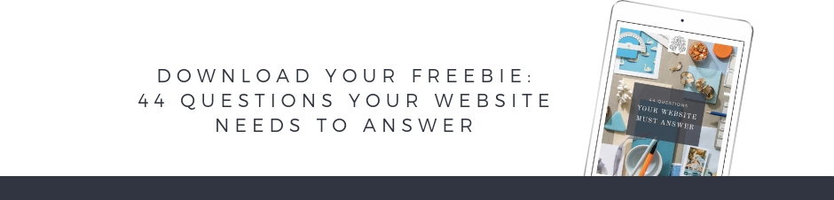
If you want a few more gut check questions to make sure your website passes, then click here or down below to grab my free checklist of 44 questions your website must answer. Use that, it has served so many people and I hope it does you as well.
I promise no matter where you are in your journey as a creative entrepreneur, you are capable of making these little changes. If you need a few more tips for your website, make sure you watch this where I’m walking you through seven more website do’s and don’ts.
Reading Time: 7 Minutes Reading time: 7 min. You’ve heard me say this before—you can spend all your dollars on ads and try to figure out a better social media strategy—OR you could increase the conversion rate of the traffic and the audience that you ~already~ have.👏👏 You can be *so* obsessed with all these shiny different marketing strategies […]

")


comments +