You could spend money on ads, try to grow your Instagram following and add new products and services, or you could increase the conversion rate of the traffic, and the audience you already have. That’s the power in optimizing your website and keeping your visitors from bouncing away before they make that key choice you were coaching them toward. Today, I am going to walk you through 5 ways to optimize your website so we can increase those conversion rates.
None of those marketing strategies that I just mentioned are bad. In fact, I love them all. I use them all, but what if we focused on optimizing what is already there and sitting in your lap? What if we tried to figure out the ways that we could capture and convert your existing traffic and existing customers, so your website was doing some of your heavy lifting?
In your creative small business, revenue is the number one metric to measure the success of the business.
I know, I know … this can kind of be a sticky subject with creative entrepreneurs because things like impact and beauty are so important to us. (As they should be … but they don’t pay the bills. Not directly, at least.)
Hear me out: when we’re just looking at the numbers (and the metrics—that is so important) it’s your revenue and more specifically, your profit that proves how successful your business is. But the next best factor—and a metric you should watch—is your conversion rate.
A conversion is what happens when somebody takes the action that you wanted them to take. Maybe it’s signing up for your email list or filling out your contact form, purchasing one of your digital downloads or purchasing one of your one of a kind handmade pieces of jewelry.
And in case you didn’t know, here’s how to calculate your conversion rate: Let’s do a little math, so say your services page on your website had 450 visitors last month and 18 people scrolled down to the bottom and filled out that contact form to inquire and get in touch with you about your photography services. 18 out of 450—that’s a conversion rate of 4%.
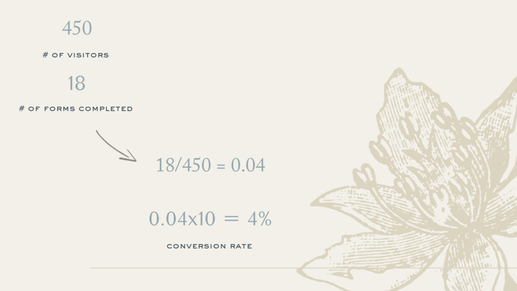
Now, conversion rates differ wildly depending on the conversion goal. I just gave you a couple of examples of those like signing up for your email list, downloading something, actually purchasing, but according to crazyegg.com the average conversion rate for a website hovers around 2.5%.
Now there are a few factors to making sure your website stands out and is converting at the highest conversion rate possible.
So that’s why I am going to show you five conversion strategies that you can implement on your website to up that conversion rate.
STRATEGY NO. 1: ANALYZE YOUR WEBSITE DATA
Before you throw your hands up in the air and say, “My new copy that I worked so hard on isn’t converting,” or “All of that brand imagery and photography I just shelled out for, ISN’T working. Or, “my new website template ISN’T working.”—Before we can reach any of those conclusions, we have to actually look at the data and see where is the leak or the gap in your current sales funnel and then assess that.
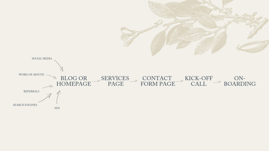
Where are people actually landing and where are they falling off? Do we need to grease the slide a little bit more and figure out why they’re not getting to that next step in your funnel?
You may have heard me say before that I like to help creatives “work from a place of rest, not hustle,” and it is because I deeply, deeply believe it’s possible.
If your website and specifically, your copy isn’t working 24/7 for you, pulling its weight and helping people go down your funnel—whether it’s to one-on-one services or products that you offer—then we need to stop and figure that out because you’re busy, right?
You’re actually doing your craft, your work, your client work. You don’t have time to sit there and sell 24/7. Your website needs to be doing it for you.
I want you to think about your homepage. If your reader does absolutely nothing else, what is the one action that you want them to take on your homepage before they X out that tab and go on to do whatever else they were going to do?
I’ve had to sit down and reassess this lately in my own business. (More on that in this week’s Youtube Episode! You can watch over my shoulder as I show you real-time analytics for my site!)
SO, what is the one action that you want people to take on your homepage?
Quick caveat: I want you to start this with an action verb. I don’t want to hear something like, “I want them to know I am a really talented calligrapher.” But I want you to get specific. Do you want them to go to your services page? Do you want them to get on your email list? What is that one goal?
Okay, now let’s talk about the things that you need to look for when you jump into your analytics and look for specific patterns.
If you’re just getting started looking at your Google analytics, you want to go ahead and start simple.
The first thing you typically want to identify is your top-performing pages.
What’s so interesting is you can see what pages you need to optimize because people are leaning on them the most.
You also want to identify places where people commonly exit.
By using Google Analytics to observe your exit pages, you can see where your lower-performing pages reveal where you’re maybe missing some capturing opportunities. For each of these pages, ask yourself: What can I do to make page stickier and provide other opportunities and resources to help get people what they were looking for or what they need?
Here are a few other things to note:
- Are they even hitting your contact page?
- Where are people coming from? Referral sources can tell you a lot about the messaging that people may be looking to see when they land on your website.
- How are people finding your site?
- Put on your scientist cap and figure out what kind of trends and patterns are you seeing.
Now, Hotjar has a pretty cool tool available with their Free tier of membership, which is pretty great. You can use it to investigate your sales funnel a little bit more and see where in that you may be losing people due to a leak or gap. (I show you want that looks like in the video!)
If you’re a creative entrepreneur, your business is substantial but, not ginormous, the free tier of Hotjar could be a huge asset to you. You can get enough insights and things done to make some changes. I really recommend seeing if it could help you!
My students inside Copywriting for Creatives™ know that I like to start with quantitative data first.
When we’re talking about optimizing your website, whether that is Google analytics or heat maps, the data doesn’t lie. Numbers don’t lie, but after you look at the data and the numbers, you could do one of two things—
Door number one, you could go in and change what you think it may be a good idea to shift up or play with. Maybe you want to add more icons and graphics or beef up your portfolio a little bit more on your services page. Maybe you want to flush it out with some more testimonials. You could do all this—none of which are bad things—and hope sales go up, or you could do what is behind door number two.
Related: How to Get Killer Testimonials
You could start by figuring out where the biggest drop-off is or where that flow gets stuck and once you understand where the problem is, then you get to play with what the problem is.
Behind door number two is really seeking to understand your customers better, their needs, what is causing them to hesitate or come up with objections? What are those conversations that are going on in their minds? Then, you can make adjustments off that.
Now, how many of us are just sticking with what was behind door number one? It’s okay, no shame there.
So many of us, especially as creatives, are guilty of making minor, minor tweaks and changes on our website to keep from “messing anything up.” Maybe it’s updating little photos or tweaking our about page, but there are some more tactical needle-moving things you can do, which brings us to step number two…
STRATEGY NO. 2: OBSESS OVER YOUR USERS
Sometimes the very best conversion tools are free. Listening is free, right?
Ask that potential new client, what was it about your calligraphy services that made her reach out and want to work with you. If you’re a creative director, how did a potential new client hear about and want to work with you?
So looking at our analytics, what we did in step one, that’s quantitative, right? We’re looking at numbers, stats, bounce rates. Inside my signature course, Copywriting for Creatives™, I love teaching how to use and look at things like heat maps, scroll maps and split testing.
The qualitative data is the really juicy stuff that gives us the why behind those quantitative numbers and statistics.
Now the easiest way to do this is—like I just said, listen. But a super fun way to collect data (and maybe I am the biggest nerd, but at least I think it’s fun) is using different website feedback tools and user testing.
In this week’s Youtube video, I show you how I do this with usertesting.com. (And, you guessed it, I think you can get a LOT done with just the free trial version.)
>>> I walk you through the exact process I suggest in the video—so I’d suggest watching along to get the step by step process.
Have you ever heard this expression before: Assuming only makes a you-know-what out of you and me.
After we look at all that quantitative data from step one, we don’t want to assume anything and that’s why step two, is so important. It’s time to actually observe your theories in action. Good ol’ middle school physics taught me that.
Plus, what I love so much about user feedback is that it shakes me out of the rut of being so in love with my own ideas. Website recording sessions will straight up remind you that if it is not clear to your user, it doesn’t matter.
STRATEGY NO. 3: MAKE SURE YOUR WEBSITE LOADS
Sounds silly, right? Kind of like the “is it turned on?” moment in most troubleshooting tutorials? Well, here’s the thing, you may think your website looks so good and it probably does when you’re looking at it with your browser and your Macbook after you’ve got all the imagery and copy plugged in, but we can’t forget about this step.
You’ve got to make sure that your website loads fast and it’s bug-free.
Now I mentioned mobile optimization in last week’s post and video, but this week, I have some ways that you could make sure that this is buttoned up and something like load time isn’t the reason that a reader or user bounces away from your website—especially because, as creative entrepreneurs, a lot of us have pretty big files.
We have large images and our portfolio work all on our website, but we want to make sure things are loading quickly so we can capture our audiences’ attention and convert them by making them do that one thing that you told me that you want your homepage to do.
Most site builders have a plugin where you can preview what your pages look like on different devices—that’s how I run a quick speed audit of my website to make sure it’s not something like the load time that’s holding me back.
Also, back in good ol’ Google Analytics, you can open the behavior tab and see your site speed pretty easily.
From there, Google will give you speed suggestions. Look for any backlash you’re getting on your top-performing pages or your homepage. If a site loads like within three seconds, I think that’s pretty good. Up to seven though is kind of considered normal, especially with the amounts of images these days on websites.
Anything over a seven-second load time needs your attention. Use your investigation skills. Ask yourself: How can I shrink some of the images here? How can I make these pages load faster?
Here’s a little image shrinking hack that I do: if I have a big, beautiful image, say that a photographer has shot for me, I’ll pull it up and then just screenshot the portion that I need for my website and rename it with an SEO file name and load that in.
There’s also great tools out there like BlogStomp.
My friends Krista and Davy Jones also did a great YouTube tutorial on shrinking images.
One more quick tip. Don’t forget to check the mobile optimization and load time for ancillary pages that you may be using with your website.
I one time was using Lead Pages and didn’t realize that on certain browsers when you tried to scroll down, the call to action button wouldn’t come above the fold, so no one was clicking it and it wasn’t converting. Because I was looking at things on my phone with my browser, I didn’t see that and it took a user to point that out to me! Lesson learned … the hard way.
STRATEGY NO. 4: LEVERAGE YOUR SEO
I took a deep dive on this exact subject in last week’s post—so I’m just reminding you here, and going to send you there to learn the tips, because It’s definitely an entire tutorial.
Conversion optimization and SEO have a very intertwined relationship. They rely on one another to function properly.
STRATEGY NO. 5: UPDATE YOUR COPY TO BE USER-FOCUSED.
Whether you’re already a pretty dang good DIY copywriter for your creative small business or you’re just getting started trying to figure out what to say and when to say it, I’m showing you exactly what I mean here by using my own homepage as a case study in the video.
I just recently optimized the copy and the content on the homepage of my website. It was working okay, but naturally, I wanted to see if I could make it work a little bit better. And here’s what I learned… (This is super interesting to me because I think it proves that no matter where you fall on the copywriting spectrum, you need somebody’s eye to come in and look at what you’ve done.)
My coaches gave me some incredible feedback on my website copy—which is why I’m so passionate about the private community inside Copywriting for Creatives™, because if we’re not able to ask others, “Am I being clear here?” “Is my value proposition shining through?” or “Was this written to my one reader?” Then we don’t know. We can’t create stuff in a vacuum. (And yes, there’s screencasts for this, too. So hop over to Youtube to see them.)
Two quick tweaks that I made:
For a really long time, my headline read: “I’m Ashlyn. I support my dreams (and two German Shepherds) as a conversion copywriter for creatives.”
Now it says: “I’m Ashlyn – Copywriter & Brand Strategist – I help you steward your story to stand out (and sell) in a saturated market.”
The original headline was fine—and it worked okay—but might as well get specific, right? Plus, sometimes my audience doesn’t know what a “conversion copywriter” is right off the bat, so I need to go ahead and speak straight to them if they don’t know.
I also tried to define exactly what I do a little bit more. I do a lot of things, but there’s also a lot I don’t do—so I’m trying to get really clear on what I offer.
I also switched the copy on my call to action button.
It went from: “Meet Moi.” (#francophileprobs) to “See what I do.”
It just became a little more user-focused and we moved it up a lot higher on the page, because my heat maps showed me a lot of people weren’t getting to it when it was all the way at the bottom of the page.
Now when it comes to optimizing your website, there is no one best practice or magical template or copywriting formula that is going to be a blanket fix every single time.
Related: A Proven Copywriting Formula That Works
I’ve heard it said before, and I truly believe it, that best practices can so oftentimes be pooled ignorance.
For every best practice that you find and show me, I can give you a client example when we did that, and it didn’t work or when we tried the opposite and that worked better. I’m telling you this because you have to do this kind of work for your audience and your business and I promise you that no matter where you are in this journey, it’s possible.
I’m teaching a free hour-long workshop that is a bit on the deeper dive into this stuff that we’ve talked about today called Separate Yourself From the Pack, How to Write Your Website Words. Thousands of creatives have joined me, put into practice the things that I teach and grown their creative businesses. Head to ashlynwrites.com/masterclass and grab your seat.
Reading Time: 11 MinutesReading time: 12 min. You could spend money on ads, try to grow your Instagram following and add new products and services, or you could increase the conversion rate of the traffic, and the audience you already have. That’s the power in optimizing your website and keeping your visitors from bouncing away before they make […]


comments +