

")


Your website homepage design is your front door/entry into your world. After all, you get ONE chance to make a first impression (just like my dad told me growing up ;)). Turns out dear old dad was kinda right at least when it comes to your homepage of your website.
But have you ever tried to write or design your website homepage before and gotten stuck?
Well, you aren’t alone— I want you to know that the website homepage is the ~hardest~ website page to write. And I say that after writing dozens of homepages for my clients and teaching thousands of creatives how to do it. And naturally, they’re going to be because you’re trying to fit an ocean into a teacup and talk to lots of different types of people at lots of different places in the customer journey.
*Even* if you have a narrow niche, you may have people that want your lowest end product or offer and you’ve got people ready to whip out their credit card and pay you for your most premium top tier offer. That’s a tall order to arrange content and write copy for.
So when it comes to your homepage and writing it to convert, booking more clients, snagging more customers or leads—I can understand it may feel like you’re hosting in the days when you were awkward in middle school and had inflatable chairs in your room for people to lounge on….kind of awkward. 😉
Instead we want that first impression to be the cool, confident version of you on your website, right?
Well today we’re going to dig into how to design a homepage & write website homepage copy that will not only draw in your ideal client but help you BOOK those clients. I’m walking you through a homepage audit and makeover you can do TODAY to secure more leads for your creative small business.

Think about your website homepage like an airport terminal — it’s not the *ultimate* place that anybody wants to end up, but it’s a path on their journey.
You’ve got different types of buyers, personas, and prospects landing here every day. We need to consider that they are all at different stages in their client and customer awareness journey and they want different things.
Your homepage has two main goals.
- Give your users useful info.
- Provide top level navigation to get them to the next place they need to go.
Okay, let’s get into these tips for writing that website homepage.
No. 1 | Start your entire website homepage design and planning with a wireframe outline
I want you to start your entire homepage design and planning process, and for sure, copywriting process by spitballing a wireframe that you need to arrange the hierarchy of the messaging in. That was a mouthful. Essentially, I’m coming at you and saying that your homepage as it stands may not have everything you need it to have so I’m gonna give you my list.
There are 12 pieces of a homepage you need (don’t worry, most of them are super short, and I deep dive into each of these with a copywriting template to boot inside CfC), but here are the 12 sections:
- 1 | The Navigation
- 2 | The Hero – Headline 1, Subheadline 2, Optional CTAs
- 3 | The Tough Love Toast aka Real Talk : I want you to bring in some real talk with what my team and I call when we’re working with clients we call it the tough love toast. This is a little bit of agitation copy before your value prop.
- 4 | Your Value Prop
- 5 | The Three Cheers: The three things that anybody that works with you can expect to find or have.
- 6 | Social Proof Pass No. 1
- 7 | The Break-it-Down-Now Process: . I need to understand in a simple map format how I’m gonna get from being completely in the dark and having this problem that I need solved to getting to where it’s solved.
- 8 | Them Mentor Bio & Onlyness Factor: I don’t wanna just hear about you but I wanna hear about how you can help mentor me through whatever problem I have
- 9 | A Fork in the road or Pricing, Product, or Getting Started Table: sort of product or pricing or getting started guide help me understand how I can essentially move to the next step in the process.
- 10 | Social Proof Pass No. 2 (top 3 best testimonials):Where you’re showcasing how I don’t have to take your word for it but other people agree.
- 11 | Lead Magnet Party Favor: Wrap it up with the party favor, a lead magnet or just a low hanging fruit way that I can get started. So you don’t wanna go out on a first date with someone and immediately bring up your wedding colors that you want to have. We don’t wanna ask them essentially on your entire homepage, click here to start working with me so on and so forth, but how can you have an offer that’s a little more low key, and usually a lead magnet is a great way to do that.
- 12 | Junk Drawer Footer:And finally, you’ll button that up with your junk drawer footer where you’re gonna put everything that did not go in that top navigation.
It’s great if your website is beautiful, congratulations, but without the right pieces of sales copy and messaging, it means nothing. It doesn’t sell anything.
Obviously, on the agency side of my business, where we write website copy for our clients, there is a little bit of tug of war with the designers in a good way. We are looking to see where we can have the best marriage of both the message and the design, but it is imperative that the entire hierarchy of that designed page starts with the message.
Even unbelievably talented website designers need to remember this axiom that, “Copy dictates design not the other way around.”
That’s why you need to start with this wire frame. Figure out all the sections and then go over to design, play around. And like I said, if you wanna change the order of these, that’s totally okay. They’re just important that each one gets addressed. If you’ve taken my quiz, you know that I also tell you your selling style. Andddd the reason that these 12 sections are important is because each one of them speaks to a selling style.

We tend to sell, like we like to buy.
It’s important that we remember the other types of buyers that are out there and that we give them what they’re looking for. Whether it is no fluff, hardcore data, or whether they’re looking for that emotional story that pulls them in —whatever it is—we’re gonna serve it up hot and ready right here.
That’s why one of the first steps of writing the copy is outlining the hierarchy of the messaging and what order your ideal prospect or client or customer needs to see these things in when they land on your page. You’re gonna understand the order after putting your ear to the ground and listening to all these people in the research phase. I talked about this in a video the other week where I walked through the seven steps you need to go through if you’re doing a website refresh or revamp you can watch that here.
Action Step: Look at those 12 sections and then look over at your homepage and make note of what is missing. Can you make an action plan to get that done and then draft all the pieces of copy for that?
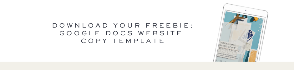
***If you’re really ready to get going then make sure you look down below and grab my freebie to my Google docs website copywriting template starters so you can take what I’ve talked to you about in here these 12 things, pull them into that document and then start writing out that copy before you ever install into your website.
You may be interested in: Never Again: 9 HUGE Copywriting Mistakes to Nix on Your Website
No. 2 | Determine your goal and be aware of an estimated conversion rate
The second thing I want you to do is to determine your goal for your homepage and establish a conversion rate of sorts to aim for this. This one’s a freebie, I’m gonna pretty much go ahead and tell you what your goal should be on your homepage. Your website homepage is not to teach new visitors everything that you do in one place, instead think of it more like the airport terminal. You’ve got everybody there now you just wanna make sure that you’re sending people to the right gate, where they can get on their plane and go on to do their thing.
So your homepage goal is to have your website visitor find what they need as quickly as possible that’s it, that’s the goal. Aka no matter what your industry, your niche or what you do, it’s to get them to page two in the process whatever that page may be for them.
>>>Really quick, take out a scrap piece of paper beside you & see if you can answer this question : <<<<
What are the top questions or needs someone would have if they landed on our homepage right now and have you given enough information where that can be solved and helped communicate how they can click over and find that solution?
Here’s another little gut check for you—Has anybody ever said back to you your elevator pitch or your value prop or your thing?
This is where clear copy is sooo important because you want not just yourself to be able to memorize your snippets but you want your ideal customer or client. People have introduced me before and said, “she’s a copywriter for creative entrepreneurs” — I *know* that that’s from my messaging. Other times people said “she’s the OG of copywriters for creative entrepreneurs” again, you see them using the same words over and over again. I took that and stuck it on my website ’cause I was like, okay, this is how they’re saying and their messaging what they call me so I’m just gonna keep that going.
Good messaging is memorizable, memorable. So see if there are snippets on your website homepage that people will be able to say back to you.
You may be interested in: How to Write an About Page that Gets You More Clients
No. 3 | Leverage how people read on most websites
If you really wanna nerd out here, the Nielsen Norman Group has been researching eye tracking and user data like this for upwards of 13 years. I remember way back at my agency job, looking at their reports and having lunch-and-learns on this kind of topic.
The main takeaway from their research is that people predominantly continue to read in an F shaped pattern (see in the image below) or a Z shaped pattern when they interact with your website and your content.
![]()
Even other patterns that all their research supports, including the layer cake pattern, the spotted pattern, they tend to be a little bit of a variation on a theme. They all come back to at the end of the day, looking like an F shaped or Z shaped pattern.
Here’s what we do for this: we’ve got to make sure that we’re putting important messages, copy, and call-to-action buttons in these prominent places on your website, specifically on that website homepage of yours.
Here are 3 quick ways we can do this today:
- Make sure that we’re designing website homepage headings and those sub-headings to direct attention to the key things we want them to look at. Make sure you are highlighting the key phrases and the keywords that your audience need to be made aware of.
- Use info-bearing words (words that mean something) in your links, navigation bar, body copy, and of course in headline & subhead copy. You’ve heard me say this before, but it bears repeating, don’t be cute and don’t be clever — cut all of that out. Just say what you’re trying to say in layman’s terms more or less. Don’t worry so much about being fluffy and poetic and beautiful – that is secondary to the message.
- Attract attention with lists and bullets. Make sure that you are veering to that left hand side of the page by using lists and bullets and explaining information clearly.
My website acts as a perfect case study. I’ve made many changes over the years as I’ve been testing and learning things.
Let’s take a look at some of those changes.
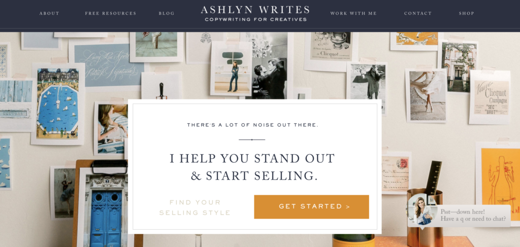
First, up at the top of my page, I opted to leave ‘Copywriting For Creatives’ as the subheading under my logo because that clearly says what I do. And that affords me the opportunity to be able to say some different things down in the hero section. So if we are thinking about the way that people read online, I definitely want to have this subheading standout with the logo, front and center at the top. Then let’s look at the ‘shop’ button in the top right hand corner, which is where you want to put the most pertinent thing that you want people to do. The shop button acts as the quickest way that they can get started and leads them directly to my copywriting templates.
The ‘work with me’ and ‘contact’ buttons are also in the top left navigation bar — anything that’s a heavy hitter you want to put there. If you look at a heat map of my website, the top left is where most people go to. On the other side of the navigation bar, you’ll find buttons to my free resources and blogs. Those can go on the left hand side because, honestly, they are not the moneymaking parts of my business, but are still important enough to be in the navigation.
Moving into the center of my homepage is the hero section. I’ve got eyebrow copy at the top of the box, but you’ll also note that the main headline sticks out. There are two buttons, one leads to a quiz, but the other, more prominent button, drives to the page that has different opportunities to be able to work together, be it in a course capacity or as an agency copywriting service. My homepage has looked so different over the years and I’m constantly trimming it down and getting more and more specific. To learn more about homepage edits and choices, head here and watch the full video.
Another example of a wonderful homepage comes from Kayla Brint, a student inside my Copywriting for Creatives course.
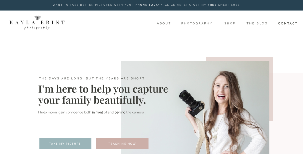
She’s got a great bar at the top, which drives to her opt-in. Your eye, or at least my eye, goes immediately to her logo, where I see that she does photography. And then you notice her very trimmed down navigation, and it’s clear how I can get in contact with her. Next my eye goes straight to her headline in the center, ‘I’m here to help you capture your family beautifully’. Based on the rest of the copy, it’s clear who she’s talking to – moms like me – and what she offers via her call-to-action buttons.
These are two examples of cleaned up homepages, where you can understand how the eye checks and moves, and how both Kayla and I used that to our advantage when laying things out. So this is something you can clean up pretty immediately on your website, right? You can open up your homepage editor right now and move some things around, so that the most pertinent information is in that pathway that your user is likely going to run into.
Another pro tip is use this placement strategy to your advantage when you’re creating other imagery and graphics. If you look at all of my YouTube thumbnails, you’ll see that the copy is over on the left hand side and my face is on the right. I also try to use this to my advantage on landing pages that I’m making for different opt-ins. I play with it and always split test things, but it’s just worth keeping in mind.
Related: How to Write a Website That Converts
No. 4 | Make it review/testimonial heavier than you may think—minimum of2 Social Proof Passes.
I honestly don’t think I’ve purchased anything in the past five years without reading reviews first. Social proof is often cited as a key element to include on your website. Because of that, people today actually look for social proof on websites.
Case studies, testimonials, and reviews on your site all provide prospects with context as to how your product or service impacted customers’ lives. Your clients and your customers are looking for social proof for somebody else besides you to say that you’re as great as you are when they land on your website—make that so easy for them to find.
The more specific you can be in your social proof the better—don’t just give me some fluffy glowing testimonial. Pull out and highlight the part that speaks to an objection that people always bring up when they’re talking to you. Use their headshot, use their first name and full name if you can, or link to their website make that person so real to me.

Think for a minute about a buying experience that you had recently online or buying research experience you had we fairly recently got a net to go over our pool ’cause we have a toddler and another one on the way. Think of an example like that as you were out there looking for whatever it was that wanted to buy, were you more concerned about your needs, your questions your concerns, or were you more interested in learning about each individual company?
Are you more concerned about your needs, your questions, and what you want —or are you more interested in learning about the company? Of course, we care more about ourselves—our priorities and our challenges.
But most businesses still talk about how great they are and why they are unique in their headlines and copy on their websites. Yes, these types of statements hold some value, but they should never be the primary focus of your brand messaging. Because, when your buyers land on your website, they are only trying to answer one question: “Can your company solve my problem or not?” That’s it.
You may be interested in: 8 Ways to Get Powerful & Persuasive Client Testimonials (+ Examples)
No. 5 | Hero Section Homepage Design and Layout
As I said, your website homepage is gonna be the hardest, andddd the headline of your homepage is the *hardest* of the hardest. 😉
In very few words we wanna get super clear on what you offer here and like I said in last week’s video, you don’t get two chances to make a first impression. We need to nail this.
I usually see one of these two mistakes: either way too many words in the header OR not enough. So on your way to that Goldilocks headline, keep this in mind: be completely clear, do not be clever and do not be cute.
When I pivoted from my journalism background and love of writing to learning how to write for websites, I had to learn to edit that out—just to be very clear, there’s still room and opportunity to add other writing devices later on, but not here. That hero headline section has got to be able to pass that grunt test (which I explain here in this video).
Action Step: Go look at the hero section of your website and perform a quick gut check audit.
- Does the hero sub-headline section of your website clear and concise about what you offer?
- Are you giving the most significant reason that this (your offer) could change their lives
- Do you have the answer to those questions above summed into one sentence on your homepage
You may be interested in: The Ultimate Guide to SEO Writing for Your Website
So, when I pull up the hero section of your site and look above the fold (before I start scrolling), will it answer those questions. Is it clear? Is it concise? For more tips and three different types of ways that you could outline this hero section, watch this video on my YouTube channel about the four different copywriting mistakes that you may be making.
Like I said, I don’t have quite enough time in this video to go into all of those sections but I hope you at least walk away with some tips on how you can give your homepage a glow up or make-over today.
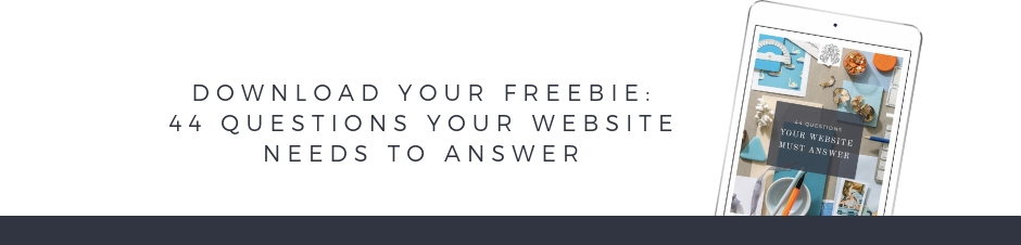
Also look below and you can grab my free 44 questions your website must answer checklists this can help you breeze through making sure this puppy is ready to go out and launch to the world.
Now you know how to design and layout a website homepage that brings them all to the yard. But what about figuring out if this website redesign or revamp process is even worth the investment if you’re gonna make it back? I’ve got that teed up for you here. And if you liked this video let me know by clicking the like button, hitting subscribe and be sure as always to comment below any questions that you may have about your homepage.
I would love to be able to dive into all 12 of these sections like I do with my Copywriting for Creative students, but at least for today I hope you’ve got a good working outline of what you need to have in your homepage. Now you are ready and able to jump onto your home page, move things around, and give it a quick makeover.
LOVE THIS SLASH NEED IT BACK-POCKETED FOR LATER?
CLICK BELOW TO PIN IT!

Reading Time: 14 Minutes Reading time: 15 min. Your website homepage design is your front door/entry into your world. After all, you get ONE chance to make a first impression (just like my dad told me growing up ;)). Turns out dear old dad was kinda right at least when it comes to your homepage of your website. But […]

")


comments +